The Doughnut of Social and Planetary Boundaries
blog | Words Matt Berry | 04 Nov 2022
In this blog series, I want to share 10 different pictures I’ve come across in my work and my studies that have helped me to make sense of the big complex world of social innovation and systems change.
Coming into the world of design and innovation, the Design Council’s double diamond diagram really helped me to make sense of what everyone was talking about. In a simple picture, it linked a conceptual approach to problem-solving (with a focus on empathy, rapid ideation and iterative prototyping) to a really practical process that I could use to structure a workshop, a sprint, or a whole design project.
But like a lot of people, the more time I spend working on complex social issues through design and innovation, the more I see the limits of the double diamond. There are plenty, but the big ones for me are:
- It focuses my attention on a narrow problem, rather than a broad vision for what could be.
- It seems to assume I’m designing /for/ people, with limited or no participation.
- It only captures the development of one intervention at a time, when we always need many.
So, in this blog series, I want to share 10 different pictures I’ve come across in my work and my studies that have helped me to make sense of the big complex world of social innovation and systems change. The pictures I’ve chosen are ones that have really stuck with me as I’ve learnt more about this space, and I hope they might inspire and shape your thinking too!
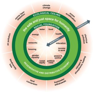
#1: The Doughnut of social and planetary boundaries (2017) by Kate Raworth
What does it say?
Kate Raworth’s doughnut is so simple, but has the potential to shift how we think about the needs of humans and our planet. What this picture says is that between a social foundation of people’s essential needs and an ecological ceiling of the planet’s boundaries is a space where we can meet the needs of all within the means of the planet. Our greatest challenge, and the goal of all design and innovation, should be to work out how we can live in the safe and just space of the doughnut.
How is it being used?
The beauty of the doughnut is that it tells a story about an inspiring new goal, but it also guides action. Each element of the social foundation and the ecological ceiling is measurable, and the Doughnut Economics Action Lab (DEAL) conducts research to check the progress of nations, cities and even neighbourhoods against the doughnut (you’ll see versions of this picture with red wedges inside and outside the doughnut to represent an economy’s social shortfall and ecological overshoot). The DEAL team are also ‘unrolling’ the doughnut to create tools for innovators and policymakers at all levels who want to move society into the doughnut.
In 2020, the City of Amsterdam officially embraced the doughnut as a framework and tool to guide their post-Covid recovery, producing a ‘City Portrait’ of their current state and using the doughnut to inspire next steps. Closer to home, the Regen Melbourne collective have co-designed a Melbourne Doughnut adapted for their local context, and are now convening collaborations around big, bold ‘beacon projects’ aligned with the doughnut; for example, to make the Birrarung Yarra River swimmable by 2030.
Why is it important?
The doughnut is inspiring as a goal for designers, innovators and organisations as they make choices about the what and how of their work. Regardless of a client or organisation’s immediate and specific goals, how can we make sure our work is helping us to move into the safe and just space of the doughnut?
Second, Kate Raworth and the doughnut were a big part of the inspiration for this blog series about inspirational pictures that have the potential to shape our thinking about social innovation. In her book, Raworth quotes visual literacy expert Lynell Burmark: “unless our words, concepts and ideas are hooked onto an image, they will go in one ear, sail through the brain, and go out the other”. The service designer’s ‘double diamond’ sticks because it hooks its ideas onto a simple picture – so what other simple pictures can help social designers and innovators to expand our thinking and improve our practice?
Read #2 of this blog series now: ‘The Development Curve’.
Follow Matt Norman on LinkedIn for more insights and ideas about social innovation.
More in this series
The Development Curve
In this 10-part series, we share 10 different pictures that can help us to make sense of the big complex world of social innovation and systems change.
04 Nov 22
Systems of Oppression
The next in our 10-part series sharing different pictures that can help us to make sense of the big complex world of social innovation and systems change.
11 Nov 22
The Berkana Institute’s ‘Two Loops’
In this 10-part series, we share 10 different pictures that can help us to make sense of the big complex world of social innovation and systems change
11 Nov 22