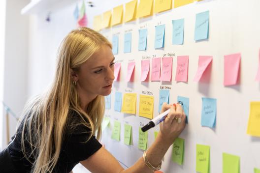
When designing for audiences with lived experience of trauma, graphic design plays a significant role in how a person experiences and responds to the content.
At Innovation Unit, we work with three core principles to guide our decisions and create designs that are safe and accessible to people with experiences of trauma.
When graphic design isn’t trauma-informed, it can cause harm through inaccessible content, through careless depictions of people and their experiences, and through prioritising the designer’s aesthetic vision over the voices of those being designed for. This can further alienate and re-traumatise people.
Innovation Unit uses these trauma-informed principles in our graphic design outputs:
1. Accessibility
Accessible graphic design is vital for inclusivity to promote choice and control over access. We support our partners to build this practice across their work with the following steps:
Colour palettes
We develop colour palettes alongside the WebAim Contrast Checker to ensure text is visible for audiences of all abilities across different designs. We also handover colour contrast accessibility guides specific to each brand for future products.
We develop colour palettes alongside the WebAim Contrast Checker to ensure text is visible for audiences of all abilities across different designs. We also handover colour contrast accessibility guides specific to each brand for future products.
Open source fonts
We choose open source fonts with a variety of weights and characters that have been designed for legibility, to support different literacy and vision levels.
Some great examples of typefaces we use are Atkinston Hyperlegible and Lexend. Partners can then access these fonts when creating their own work.
Brand guidelines
In all our partner brand guidelines, we specify typography is at least size 12pt and recommend using the NHS Language guide when writing for wider audiences. Making content easy to read, understand and produce reduces barriers to access.
In all our partner brand guidelines, we specify typography is at least size 12pt and recommend using the NHS Language guide when writing for wider audiences. Making content easy to read, understand and produce reduces barriers to access.
2. Safety
When working for trauma-informed audiences, it is important that everyone feels safe and supported when interacting with outputs we produce. We do this by considering:
Colour theory
Where possible, we avoid true black and white in our background and text colours to reduce strain. We understand that, across different cultures, colours represent different emotions and actions. We always consider our audiences in this context and recognise the importance of sense-checking colour palettes with a wide range of people.
Where possible, we avoid true black and white in our background and text colours to reduce strain. We understand that, across different cultures, colours represent different emotions and actions. We always consider our audiences in this context and recognise the importance of sense-checking colour palettes with a wide range of people.
Text
We avoid use of capitalised sentences that can feel overly forceful.
We avoid use of capitalised sentences that can feel overly forceful.
Visuals
We are mindful of creating visually overstimulating designs that can provoke anxiety. For trauma-informed materials we prioritise spacing, symmetry and consistency in layouts to create a sense of security and predictability.
We are mindful of creating visually overstimulating designs that can provoke anxiety. For trauma-informed materials we prioritise spacing, symmetry and consistency in layouts to create a sense of security and predictability.
3. Empowerment
Our tools, designs and outputs are informed by lived experience of trauma.
We recognise that by including people with lived experience and/or expertise in trauma-informed practice, this allows us to create work with greater impact. We are guided by their needs and perspectives, and work together to create products that are meaningful and sensitive.
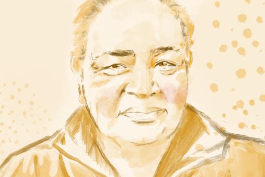
When creating a brand for Living Well in Salford, we worked with J, a local poet and artist with lived experience, to design the logo. His artwork of a 5 branched tree informed the rest of the branding through nature oriented colour palettes which are used in other trauma-informed spaces in architecture and interior design. This gave the branding a meaningful connection to local people, as well as having trauma-informed design values throughout.

In Living Well’s ‘Waiting for Something Better’ storybook, we supported lived experience storytellers to direct how we illustrated their experiences accurately, in a way that was representative but also felt safe for them. The resulting images included portraits, animals, hands, and meaningful objects. All the drawings were shared with the storytellers and approved before publication. This allows us to create connections with the reader through illustration while giving people control over their story and their experiences.

Graphic design is a core feature of Innovation Unit's work, supporting us to reduce inequalities and transform systems alongside our partners. Ensuring graphic design is accessible, safe and empowering reduces harm and provides safe opportunities for people with experience of trauma to influence change.
Share this page